|
Follow the links below to articles, sketches of projects in progress, images and connections to information of interest.
| Apartment House |
|
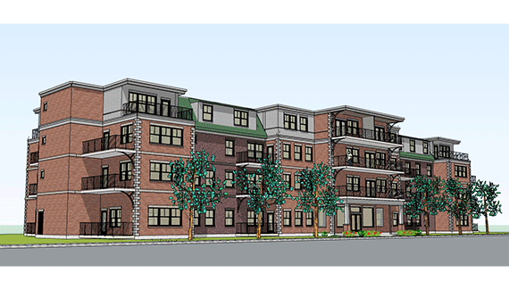
| A private investor is developing a 38 unit market rate downtown office building for empty nesters. The complex will include a private balcony and covered parking for each unit. |
 |
| Superior Courthouse |
top |
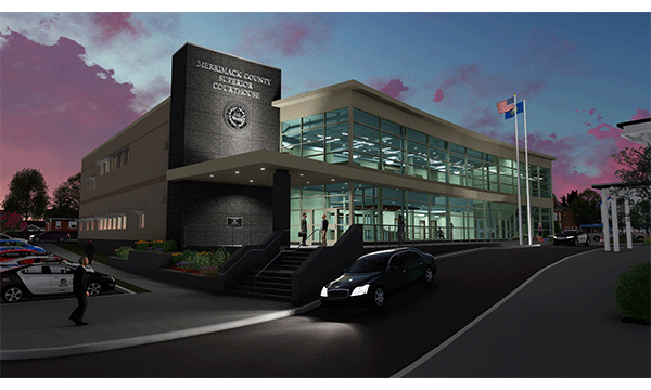
| Merrimack County, New Hampshire is joining with a local developer in a public-private partnership to keep the new Superior Courthouse in downtown Concord. CNCA is working in conjunction with Cowan|Goudreau Architects of Concord to provide design and construction phase services. |
 |
| Law Offices |
top |
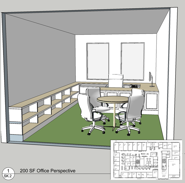
| A major New Hampshire law firm is planning a relocation to 24,000 square feet of office space on 2 floors in a new office building. CNCA is providing space planning and interior design as well assistance with space needs analysis and lease negotiations. |
 |
| |
top |
| Endicott Hotel |
|
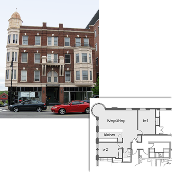
| CATCH Neighborhood Housing is converting a downtown landmark into market rate apartments in Concord, NH. In its new incarnation, the Endicott Hotel will include 30,000 sf of mixed use retail, restaurant and residential uses. Plans include façade restoration consistent with the building’s historic character and renovated apartments will include 1, 2, and 3 bedroom units, many with bays offering city views. The project promises agreeable, affordable living walking distance from shopping, entertainment and restaurants. |
 |
| |
top |
| Greater Concord Chamber of Commerce |
|
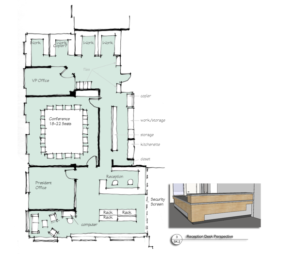
| The Greater Concord (NH) Chamber of Commerce and Capital Region Visitor Center are moving downtown from their current location on Horseshoe Pond. The new location will be in the Smile! Building currently under construction on South Main Street opposite the Capitol Center for the Arts and the Kimball Mansion. The new space will include offices and meeting rooms for the Chamber and a reception area where visitors to the region can get advice and information about things to see and do in New Hampshire. CNCA is providing space planning and interior design services. |
 |
| |
top |
| House with a View |
|
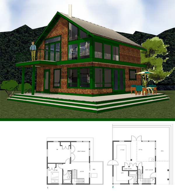
| Our client for this project is a professional woman with a piece of rural land in the Michigan Hills overlooking the Great Lake. The view of the lake and the country to the south and west are particularly important to her as is passive solar gain and natural ventilation. With the aid of insulating shades, a superinsulated envelope and an open plan, she will use a woodstove to keep the house comfortable in winter. |
 |
| |
top |
| Converted Barn |
|
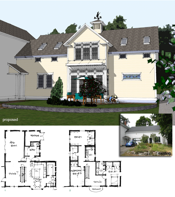
| A couple with a dream of retiring to New Hampshire found a large Victorian house with an attached barn near Lake Winnipesaukee. The house includes rental units and a solid barn no longer needed for sheltering animals. Not wishing to lose the tenants, our clients asked us to help them make a new house within the structure of the old while taking advantage of the sun, the breeze, the view and the latest in sustainable design. |
 |
| |
top |
| Lakeside Cottage |
|
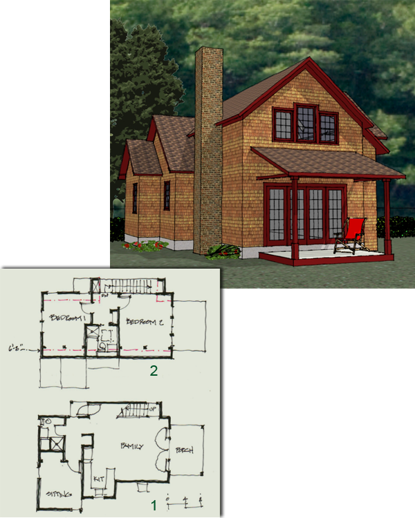
| A small lot with a run-down camp on the edge of Little Squam Lake offers both a problem and an opportunity. Removing the camp leaves only 870 irregularly shaped square feet to build on due to contemporary conservation and zoning restrictions. On the other hand, the view and the location are perfect. We worked with our client to create a comfortable retreat with 2+ bedrooms, an expansive view of the lake and a gross area of 1290 sf including the porch. The project is in design. |
 |
| |
top |
| |
Stylin' |
 |
by Christopher N. Carley, AIA, LEED AP
First published in the Concord Monitor
A common way to classify architectural design vocabularies is by “style”. Real estate advertisements speak of “colonial” or “contemporary” designs and some plan books get downright poetic with references to exotic “Mediterranean” or stately “classical” designs. Many people begin their planning with a style in mind and strive to be true to it as they make decisions. Before going that direction, it is helpful to consider what “style” really is and how it differs from design, which is what you are trying to do.
Suppose that you are designing a house for your family and you have decided that you want a “colonial,” which to most of us means a rectangular plan, a symmetrical façade on one of the long walls with a front door facing the street, double hung windows, a pitched A-frame roof, clapboard siding, and, at the kitchen end, a garage. Let’s say that your family includes you, your spouse, a large dog, a son who plays hockey and a daughter who loves art. Finally, the lot that you want to build on faces the street on the east side and slopes down to the south. It is rectangular with the narrow dimension facing the road and it has neighbors on the left and the right.
With the colonial in mind, you lay out your footprint with the “front” facing the street and the garage on the left. Then you notice that the shape of the plan means that you are pretty close to the neighbors on both sides and you have to walk up steps by the driveway to get to the front door (which will never be knocked on by anyone you want to see), where you walk up more steps. You also walk up steps from the garage to the kitchen. Because your plan crowds the lot lines, there is no place for a mudroom off the garage, which leaves your son’s hockey gear homeless for the winter. The garage takes up the entire south wall which means your cars will be warmed by the sun, but you won’t. Because the narrow end of the house faces north, there is no room for a studio for your daughter who would like the diffuse light for painting. Your spouse, who has a troublesome knee, is not excited about walking up steps at the end of each trip home. You look at the cost of heating fuel and notice that most of your largest windows are on the east, where they will lose heat most of the day. The dog is happy, though, because there is a really big back yard.
So, you try turning your colonial plan 90 degrees. This lets you open the windows to the south, stretch things out for a mudroom and find a place for the studio. Even the garage is now on the level with the rest of the first floor. The dog is a little cross about losing some territory, but he’ll get over it. Then your spouse points out that all you can see from the street is the garage door and a couple of randomly placed windows on the gable end, not to mention that the front door looks kind of dumb half way back on the lot.
What to do? Think like an architect and let “style” take care of itself. Consider breaking up the rectangle and arranging your plan for south and north light, create a presentable entrance that visitors will recognize and everybody will use, and set the garage where it does not dominate everything you see when you come home at night. There is no reason that the vocabulary that you favor, the clapboard, the windows, the general proportions, the pitched roof, cannot be part of the solution, but they should work with, not against you. You may not solve every single problem perfectly (the dog may still be miffed), but if you don’t let “style” hold you hostage, you will at least have a fair chance.
There’s nothing wrong with thinking in terms of style. The most important thing to know about it is that it is a classification applied after the fact by historians. The designers who invented what we think of as styles were responding to the purpose of their buildings, the physical environment, the materials and resources at hand, and the society in which they lived. To be sure, the forms and conventions of the buildings and other things around them were their starting point and form does have an intrinsic grammar that styles reinforce (more on that in another column). It’s also true that certain styles have endured because the designs they grew from worked well in their context and began to take on meaning of their own but, for the designers most in tune with their reasons for building, conformance to “style” does not seem to have been the goal. That is one reason why originality in design is more valued over time than is imitation.
Don’t be afraid to take control of your design and be original, it’s often the safest thing to do. |
| |
top |
| |
|
| |
Patchwork Quilt |
 |
by Christopher N. Carley, AIA, LEED AP
First published in the Concord Monitor
“I have all these ideas from things I have seen in magazines and on TV. How do I work them into my design?”
If you are thinking about a building or remodeling project, you may have started by scanning home furnishing magazines, catalogs and the web for ideas and pictures that you like. House plans are for sale in magazines and on line and most of us have noticed something in the home of a friend or on TV that seems attractive. A common result of this kind of research is a file folder full of clippings, sketches and print outs that, when laid out together, look more like a ransom note than a design. This is not necessarily a bad thing. Chances are excellent that your pile of paper includes several messages from you to yourself about things that you find important in a home. Here’s how to break the code.
First, if your ideas are varied and come from many sources, prepare to let some of them go, at least in the form that you first found them. Successful architecture, like all design, requires that every plan have an intrinsic integrity. This means that some things you might include will contribute and some will detract. This is especially true if you are remodeling and are constrained by an existing building.
Second, look over your collection for things that keep coming up (or don’t). Here are a few questions that you can ask to help you benefit from your research.
- Do the things you like imply a large space or a small one? If a large one, do you really have the room?
- How does daylight figure in the pictures that take your fancy? Often interior design photographers stage a scene to imply a certain time of day and even a certain kind of view through the window. If that’s a big part of why something appeals to you, think about how close you can really come to that on your own site.
- If you consistently choose designs of a particular “style,” what are the characteristics of that style? Are the materials close to their natural state like rough wood or stone or are they more refined and synthetic like painted wallboard and polished metal? Do the details tend to look hand made, a carved wood banister, for instance, or machine made, like a smooth metal pipe rail? Architects call this the “vocabulary” of a design.
- Is there a consistent geometric quality to the things that you chose? Do you find yourself favoring graceful curves, or disciplined right angles? Do you tend toward regular shapes like squares and circles or do more complex polygons and irregular shapes seem to dominate?
Once you start to look at the pieces of the puzzle this way, you can to identify what your own vocabulary of design ought to be. The goal is to draw out and use characteristics that are appealing and meaningful to you without being knocked off the beam by someone else’s ideas coming from a different context.
The next step is to set aside your scrapbook and think about exactly what you want your design to do (or what you want to do in it). In the case of a single room remodeling, this may be a relatively simple question, if you are thinking of adding several rooms or building a whole house, the answers get more complicated. It helps to write down your thoughts both as a list of things that you want and as a narrative describing the kind of place you want those things to create. Architects call these notes a “program.”
The last part of your preparation is to take a thoughtful look at your site. It may be one room, a vacant lot or a large piece of undeveloped land, but every project has a site and nearly every site has some special characteristics. Elements to consider include orientation to the sun, views and privacy, access, the slope of the land and how it drains, where the wind and weather come from, and, in the case of an addition or renovation, how it relates to the building that you already have and expect to keep. This is where your cloud of ideas can fog you in, particularly if you are trying to use or adapt a preconceived plan. Prototype house plans are almost always designed with a non-specific, flat, suburban site assumed. If that’s not what you have, strive valiantly to keep an open mind about whether the packaged plan really works in the place where you plan to build. Finally, if the magic is working, you’ll have the tools you need to start designing—a site, a program and a design vocabulary derived from your own response to the things around you, not just a pastiche of other people’s ideas. Have fun. |
| |
top |
| |
|
| |
I'd always thought I might like to be an architect if I hadn't gone into... |
 |
by Christopher N. Carley, AIA, LEED AP
First published in the Concord Monitor
Often when I meet someone new and we declare our occupations, my companion will assume a wistful expression and say something like, “I always thought I might have liked to be an architect too if I hadn’t gone into…” Perhaps one of the reasons why the “I always thought…” remark is so common is that most of us are architects from time to time in various ways, regardless of how we make a living. Even small children will rearrange their things with purpose and who among us has never had to lay out the furniture in a room or office? Most people live in houses or apartments that are a big part of their lives and more or less under their management. The principles of architectural design and design in general are among the tools we use to make a life. If we use them skillfully, the things we live with will help and please us. If we apply them badly, we risk dwelling in an expensive, ugly clash of stuff.This column is devoted to the skillful use of design.
What separates good from bad design? Creativity and great ideas are important—certainly coming up with consistently bad ideas will slow progress, but the truth is most of us come up with both good and bad ideas at the same time when working on a problem. Rejected ideas are no cause for shame and good ones won’t make a design by themselves. We need to edit our inspiration. Often, the problem with an idea is not even that it’s bad; it’s that it doesn’t fit the Big Picture.
Which brings me to the first rule of good design: have a Big Picture, even for a small project. If you want to impress your friends, call it a concept, but under any name it should provide the energy that both supports and tests your ideas.
Suppose you want to remodel and rearrange your living room. To find your Big Picture and create a concept, ask yourself these basic questions. The answers are useful whether you are setting up a campsite or designing a multimillion dollar building:
What do I want to do in here? Your answers might include... entertain one or two couples in the evening, watch TV with my family, read and listen to music, or impress the parson at Sunday Tea. Most likely, you will get more than one answer; few rooms serve only one purpose. Record your objectives and refer to them regularly, any design element that doesn’t serve them needs a hard second look. If it’s difficult for people to chat face to face, the TV competes with a sunny window, there is no good light for reading, or the mood is all wrong for spiritual communion, then something needs to change. This seems elementary and not worth mentioning until you think about the number of rooms you have visited where the question seems never to have been asked.
Where is the sun? The amount and quality of natural light in a space will have a significant effect on how you experience it. Take a look at the window exposure and think about what kind of light you have at what time of day. If you are never in the room in the daytime and it gets the best south light in the house, maybe you, or the living room are in the wrong place. If it faces north and it’s where you like to meditate, you may be on to something good.
How will I move through and in the space? Architects call this “circulation” and it’s a critical part of any layout. Generally, the best circulation (except in a corn maze) is straight and simple. If you have to dodge, weave and vault over obstacles to move through a space, you are probably giving up room to walking around that could be better used otherwise. You will probably also be creating unnecessary complexity and formal confusion, which is another word for ugly.
Put out the trash. There is no shame in rejecting an idea that is not working; even of you did think of it yourself. One of the hardest parts of the creative process is saying good-by to notions that you love or are very used to. It may be that the Morris chair is just too big for the corner or that the couch and the computer are never going to play nicely together. If you have a solid Big Idea and are true to it, you will probably have to change your mind about some of the details as you go along. Be fearless.
If you think of yourself as an architect, work with a Big Picture and ally yourself with the Sun and simplicity, you can expect your room, your house, and the time you spend in them to be better by design. |
| |
top |
|

